Design Lead
4 Weeks Concept Exploration;
4 Weeks Iterations;
2 Weeks Handoff
Web
Personal Capital has two transfer systems. One provides a High Yield Savings Program for all customers while the other targets wealth management clients (at least $100k invested inPersonal Capital). They are each run by different partner financial institutions and have independent flows; however, we wanted to consolidate these two into one in order to optimize the flow and also provide recurring transfers for all customers. The reason behind this was two fold: one, to build a holistic transfer experience for our customers; two, to boost the money deposit in Personal Capital and increase our AUM and funds in the High Yield SavingsProgram.
PCC (Personal Capital Cash) is a high yield saving product that faces both prospects and PCAP investment clients. It’s easy to enroll and has no management fees and 0.1% APY (was 2.30%APY when we first launched this product). It has a specific entry point, and users only need to provide their routing number to continue to submit transfer requests; our partner bank, UMB, will help them complete the transfer on the backend.
PCAP investment is our core product that drives our controllable AUM and brings revenue into our business. This product targets all of our clients who have invested at least $100k into our platform. The transfer requests can vary based on the needs of our clients, and each one needs to be reviewed by our financial advisors, then submitted to Pershing (our partner financial institution) to complete the transfer request.

As you can see from the screenshots, the flow and logic between PCC and PCAP investment transfers are quite different. Even the design style is not consistent. Coming up with a design that could support both transfer systems would be the biggest design challenge for me.
The goal was not only to consolidate the two transfer systems, but also to optimize the current transfer experience and cover 17 different use cases, such as ACH transfers, ACAT transfers,Trust Account and Manual Account Transfers, etc. We also wanted to offer users the option to set up recurring transfers.
This is the final design demo of Funds Transfer.
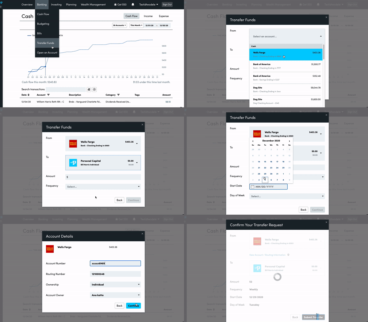
As I mentioned before, PCC and PCAP investments have two different entry points, and the design styles of the two transfer forms are inconsistent as well. In order to solve this problem, here I used a modal instead of a full page for those two entry points, so no matter where users clicked from the navigation bar, the modal would be populated.
I was inspired by the experience of withdrawing money from a bank in the real world. When I do so, the staff ask, "Do you want to make a deposit or withdraw money?" I thought that it would be more intuitive to provide different transfer options, and then we can direct users to different transfer request flow. So on this modal, it lists three different transfer options at the top: deposit money to Personal Capital (including both PCC and PCAP investments), transfer between PCC and PCAP investment, and withdraw from PersonalCapital.
Secondly, we will show the user’s recent transfers. This is to remind users of their recent transfers so as to prevent them from duplicating the transfers. Lastly, there's an entry point for viewing/managing recurring transfers.
One of the biggest problems with the current flow was that we didn’t support transfers between two Off-us accounts, so if users chose two outside accounts, the input fields would be cleared out, which was annoying.
Secondly, as we couldn’t filter the account list based on the account users selected in the previous input field, it took too much time to select the account from a long list if users had many linked accounts.
We took some insights from our interviews with our financial advisors and customer support saying that some of our clients were complaining about that. Those clients often had more than10 aggregated accounts, so they were becoming a bit frustrated during the transfer.

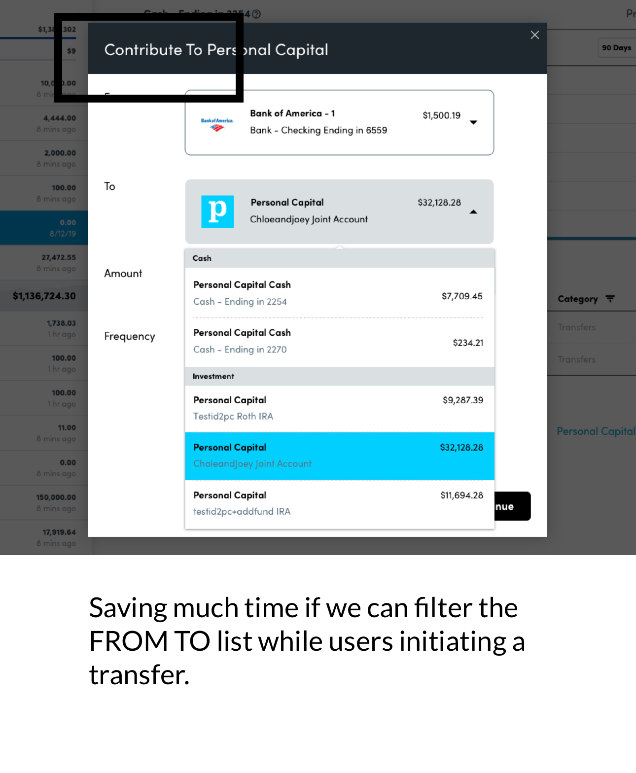
I came up with a design that requests transfer options in the beginning of the flow. If users choose deposit, it will take users to the next step with the modal titled "Contribute to PersonalCapital," and when clients select the account, only On-us accounts appear in the TO list. It looks much cleaner than the previous design and it’s easy to pick the accounts in FROM and TO. I assumed this design would help clients initiate more transfers than they used to.
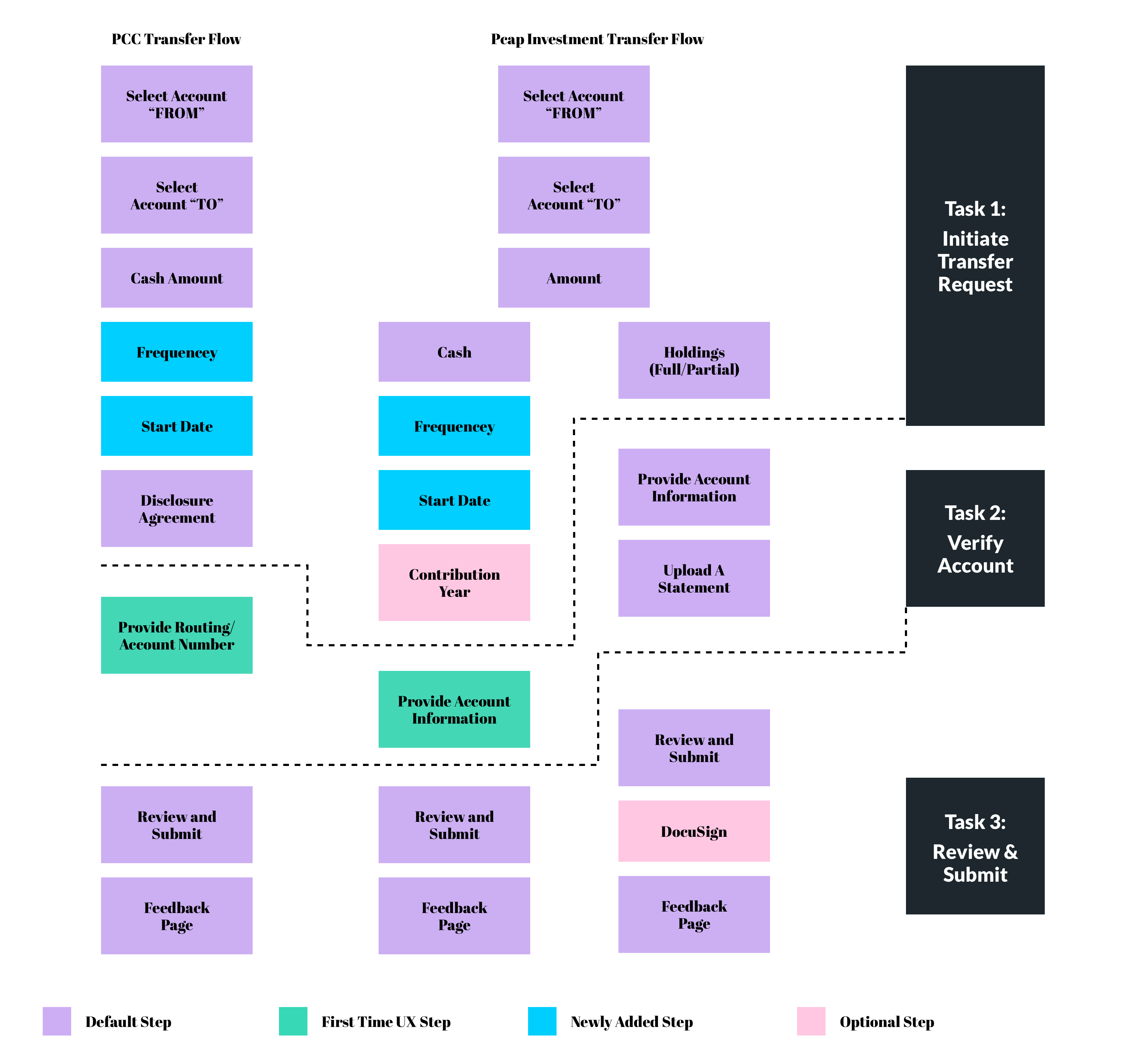
The flow between PCAP investments and PCC is quite different, and there are tons of edge use cases, like ACH transfers, ACAT transfers, IRA account, Trust Account, etc. Therefore, I consolidated the different use cases and extracted some generic task flows for these two transfer systems.
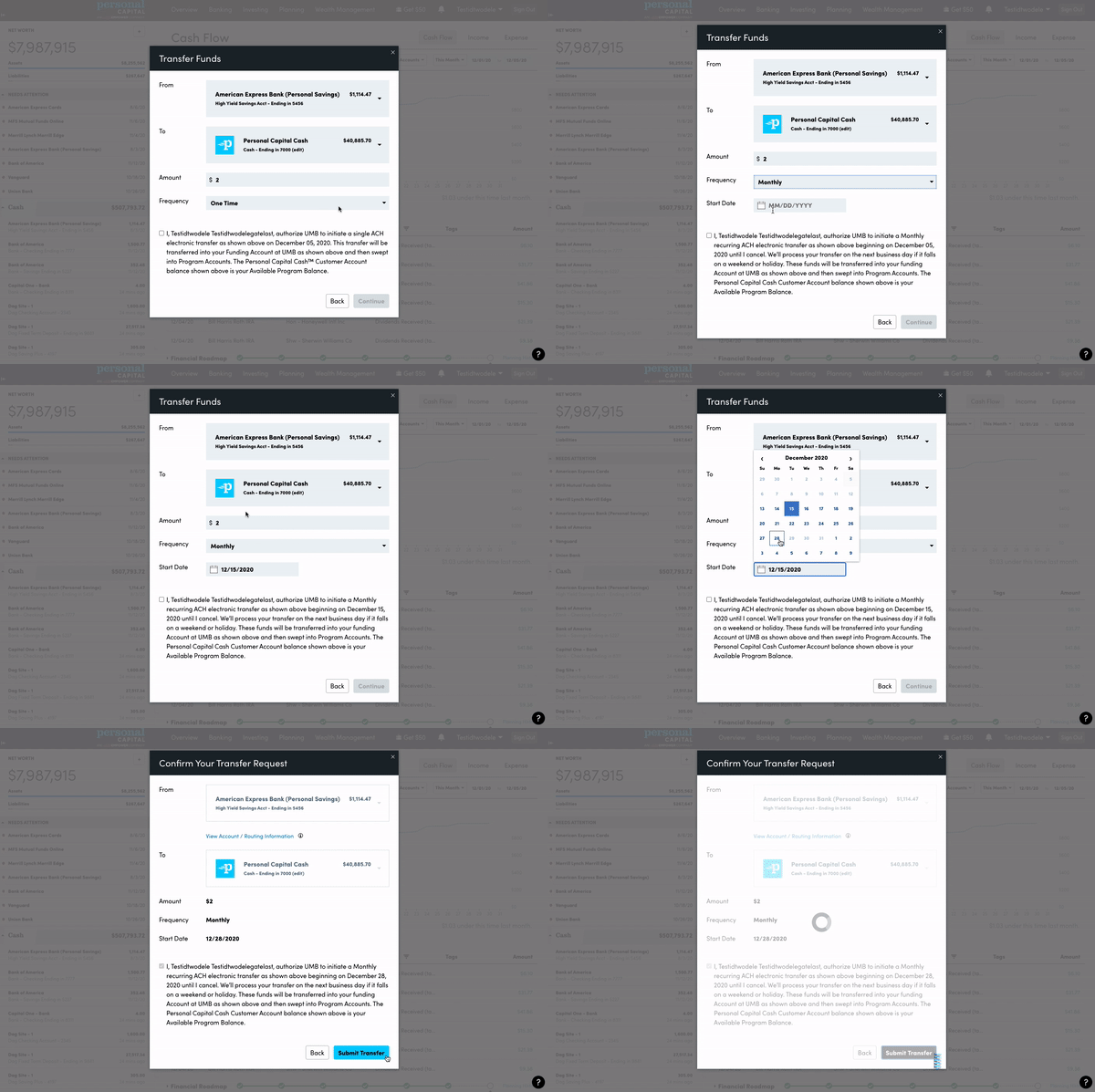
In the transfer modal, we enabled users to set up the frequency. The default is one-time, but if users want to set up a recurring transfer, they can select it from the dropdown, and it will populate a calendar so that users can pick a date directly from the calendar.
There are many edge use cases, including failing to verify the account, transferring from a linked manual account, Micro Deposit Verification, etc.
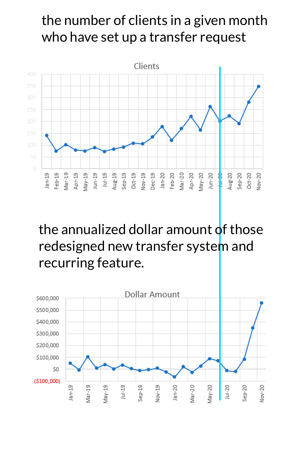
We implemented this merged transfer tool in summer 2020, and the results were really exciting. As you can see from the chart, there was an immediate jump in both scheduled transfers and annualized dollar amount. According to the chart, it reached almost $600,000 in Q3, an increase of 274% compared to Q2 before the release of the new transfer system.👏👏👏👏