Design Lead
1 Weeks Concept Exploration;
1 Weeks Iterations;
1 Weeks Handoff
iOS Handset, Tablet
As iOS 14 introduced the smarter, faster and more accessible widgets, we start to think it's the best time to build this widget and serve Personal Capital users a quick glance about the app content.

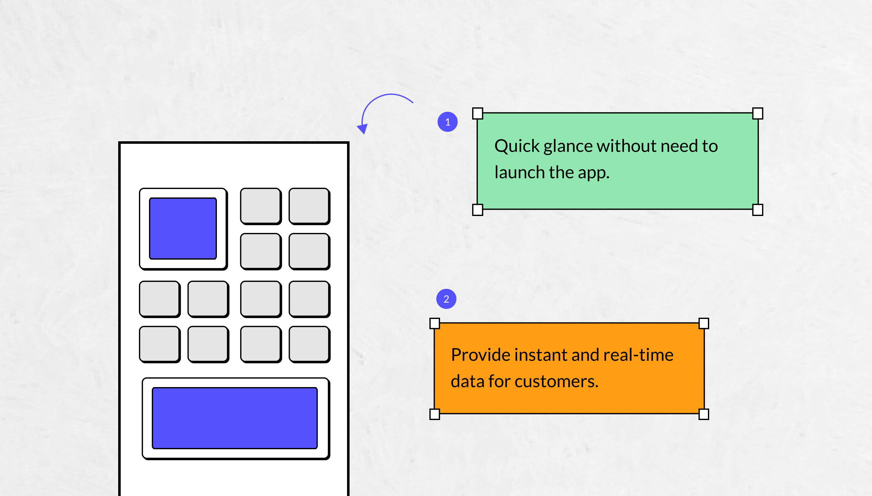
We understood that people would like to install the iOS widget onto their home screen. By looking at the home screens, they are getting more cluttered with apps, a widget lets a user access app content in less than one second instead of finding the app icon and launch the app.
Widgets are especially helpful for displaying important real-time data, which is significant important for a finance app users. With this widget, people can track the updated data at anytime as they like.
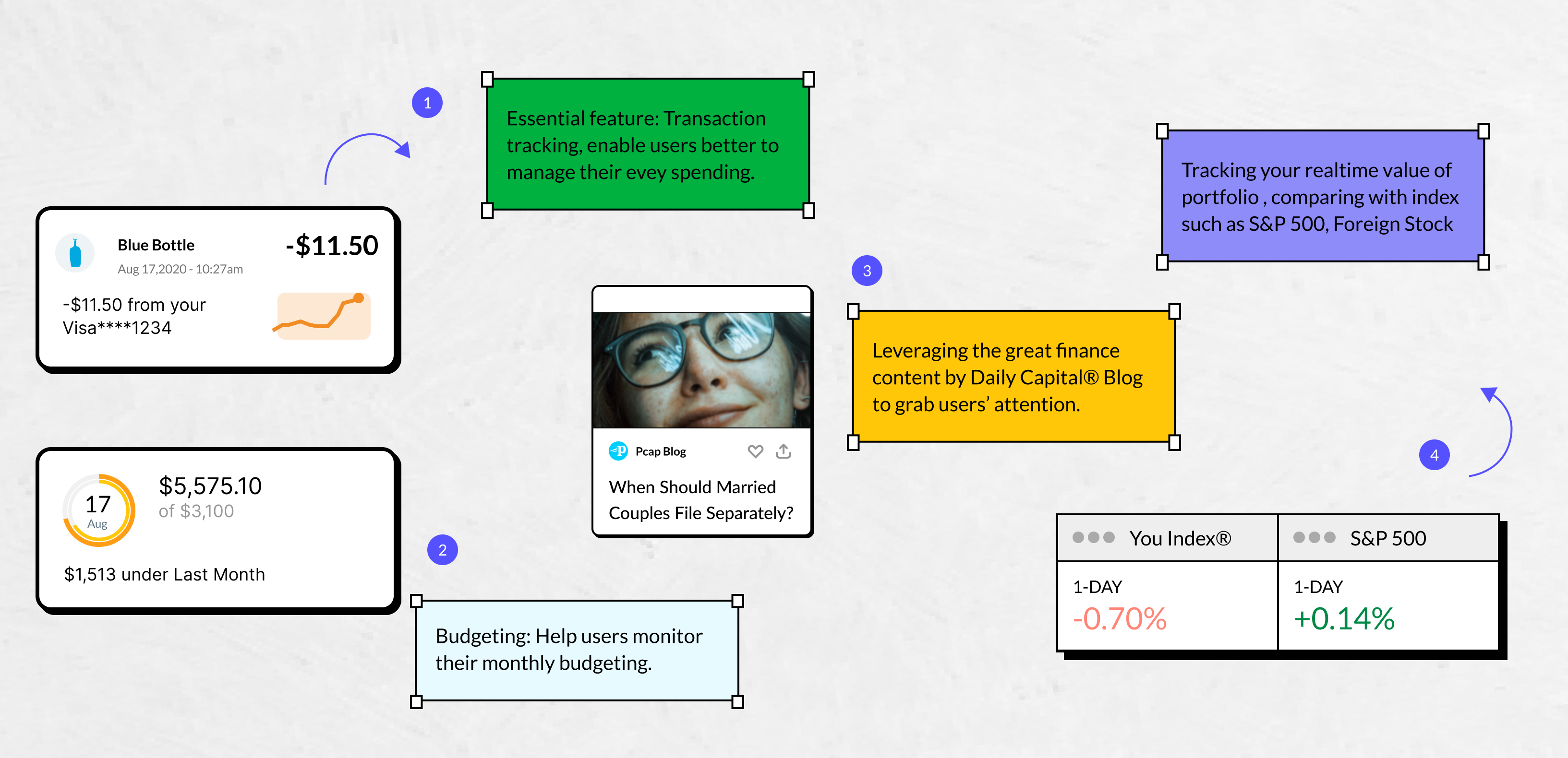
Inside of Personal Capital app we have a bunch of great features that support people with their daily financial lives, such as transactions tracking, Budgeting, Investment Holdings, Capital blogs etc. Each pillar plays a big role in the product, however in terms of the tight project deadline we only have the bandwidth to develop one as the first release.
There're different type of users and each group of users have their own needs and goals. In order to better make a product decision we drill in and deep dive about our platform users, and see what kind of things they are expecting to accomplish in this small widgets.
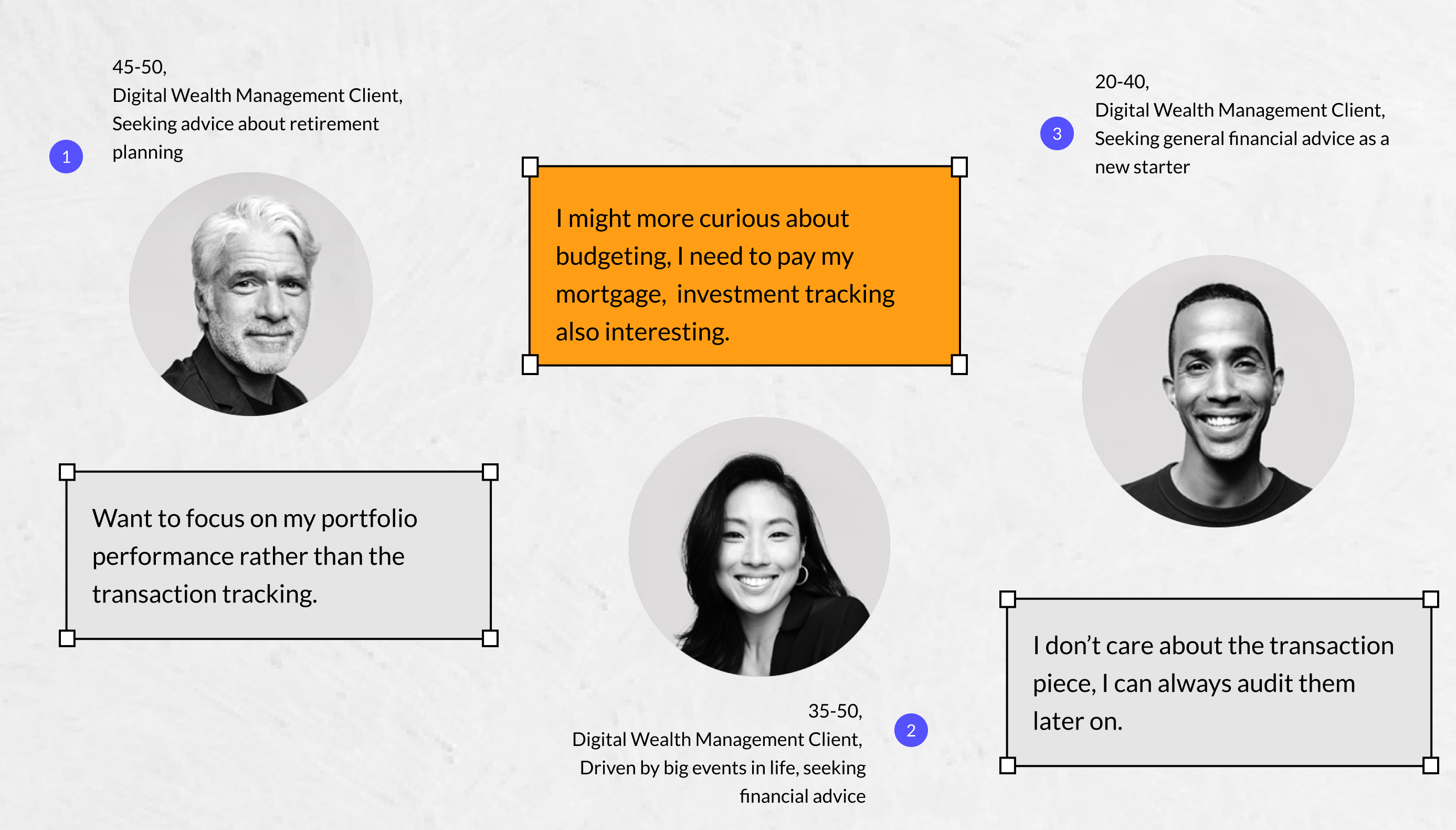
It seems that holdings tracking and budgeting tool are the winners, for some reasons I can empathize that, transaction tracking is essential however it's not a high frequency used tool that users need to look for every day. Daily Capital® blog is an interesting part to educate existing users and acquire new users, again it's not the best option to be addressed in the widget.
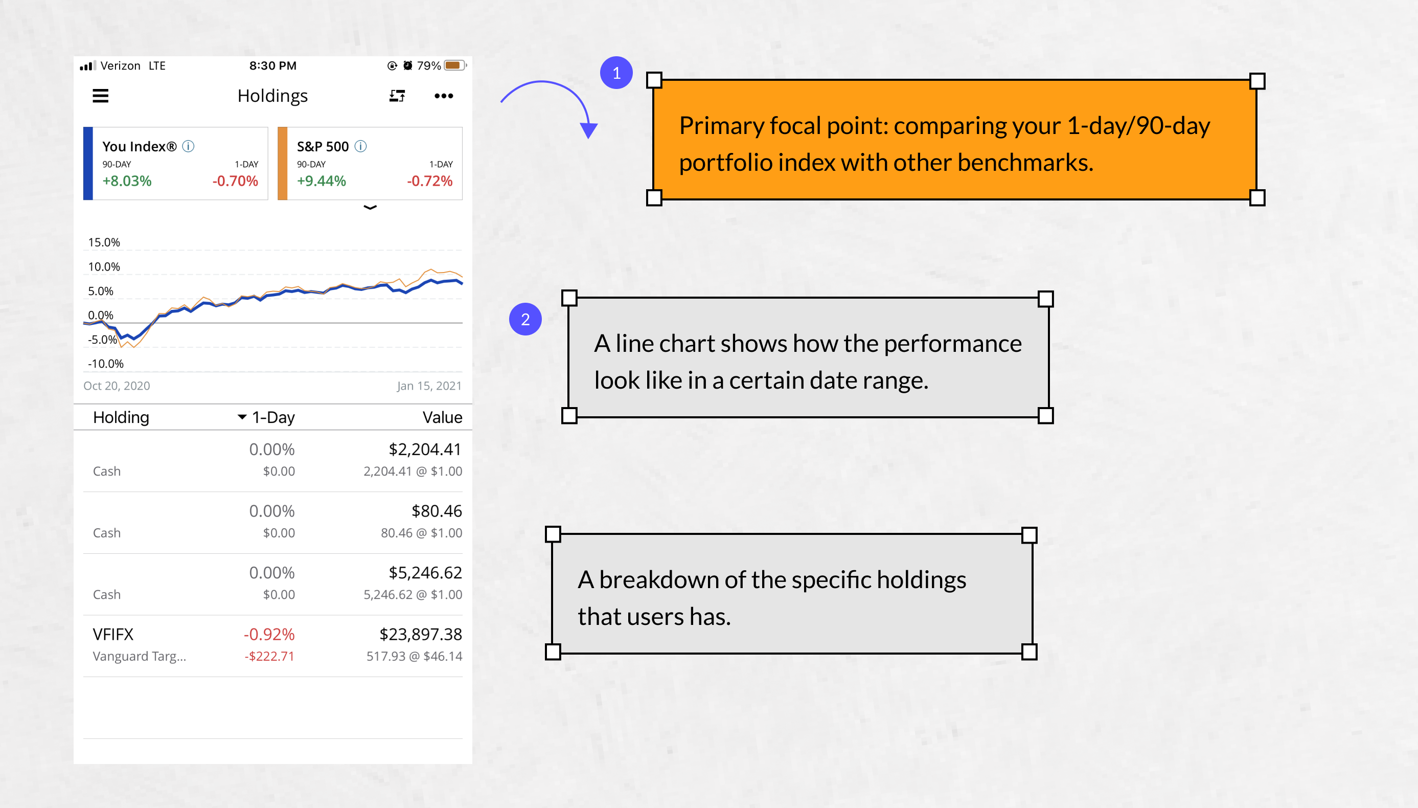
Without a clear understanding of existing mobile design of this investment feature, it's hard to visualize how that widget look like. So in the early stage of my design, I started to do a quick analysis of current page. It's not difficult to find the primary focal point is the two card at the top, it draw users' attention to the 1-DAY/90-DAY change of your portfolio vs. benchmarks such as S&P 500, Foreign Stocks, US bonds etc. It delivers the summary of how your holdings performance in a first glance.
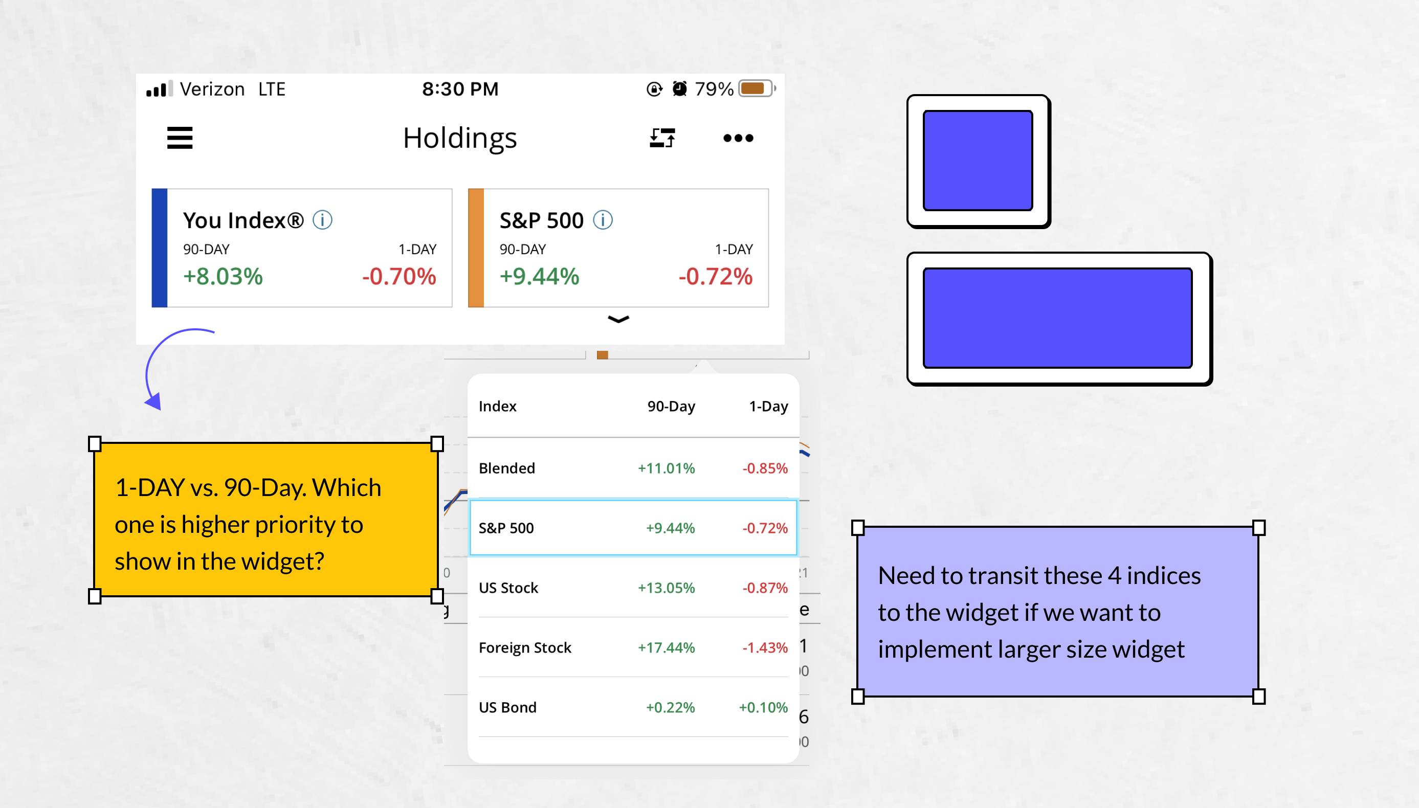
As considering to transit those two cards into a smaller widget, I definitely need to do some information wise tradeoff since it can fit in such small widget. Looking at the two sets of data, I started to ask myself, what's the scenario that users might need to use this widget? And why do we want to build this widget for our users? The purpose of the widget it more like serving a tool for day to day basis, having them focus on every day data changed can be helpful to the user engagement. So I continued the design with showing 1-DAY changed data.
Apple has many constraints about customizing your own widget, in the early iterations I have three explorations and tried to reinforce our brand identity to the widgets. The first option I'm using our Clarendon font style in the index label, that's one of our brand identity, we used it in our marketing materials such as landing site, webapp tool. However the license we purchased is only allowed to use in those platform, not mobile related platform so we had to switch to our mobile font Open Sans. The second option is incorporating our logo in the widgets to remind users the data and content is from Personal Capital.

The second option users can clearly see the logo which is helpful to reinforce the brand, however it takes some space so the way how those 4 datas structured looks busy. We synthesize the feedback and I continued to iterate the design, here is the third option, leveraging our primary brand color combo: black (#000) and blue (#00ccff) to provide the familiarity and consistency to our users. We like this option because it can fully leverage the full space to communicate the data change, and subtle way of express the brand identity can help users better focus on the information itself.
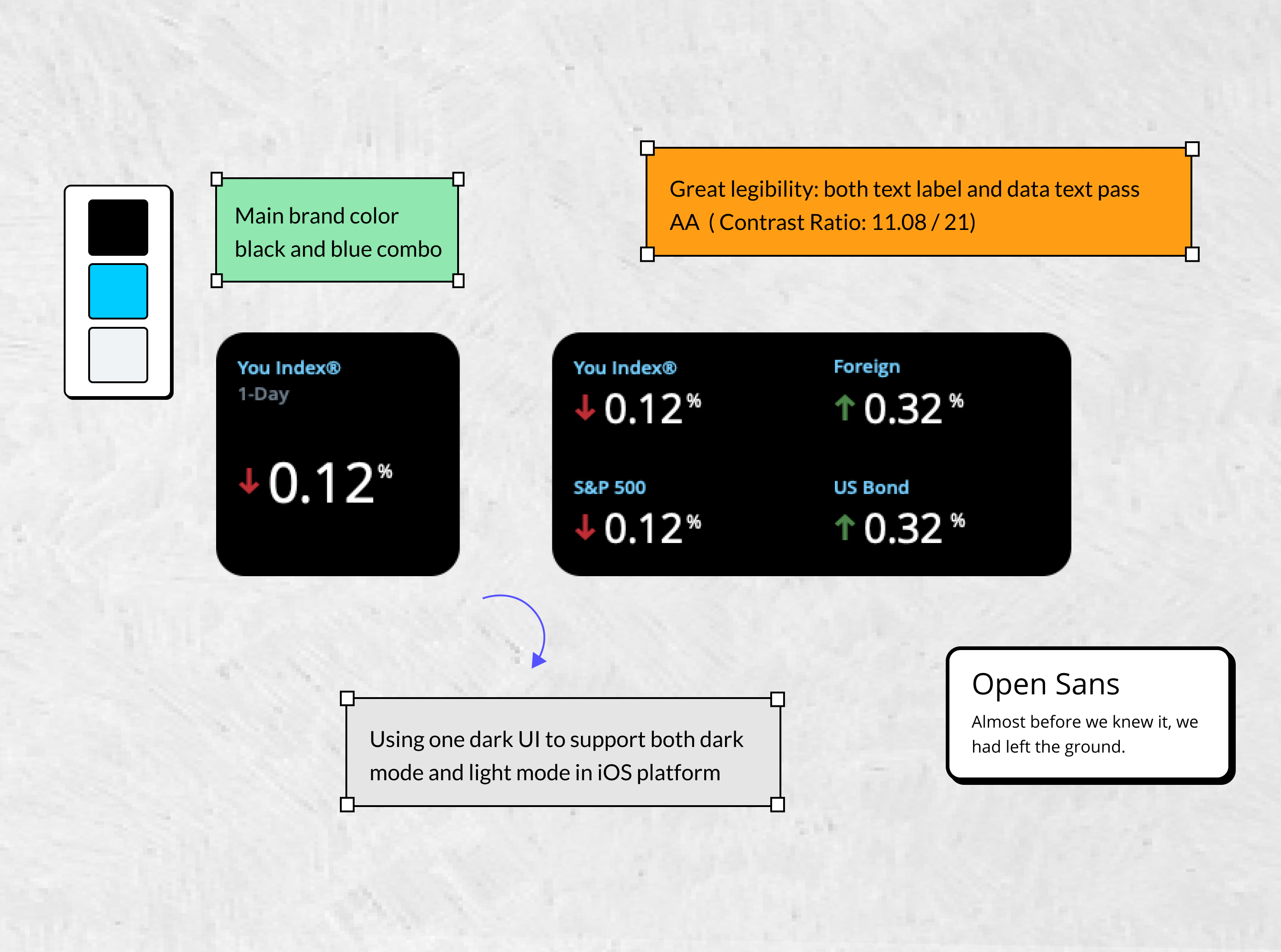
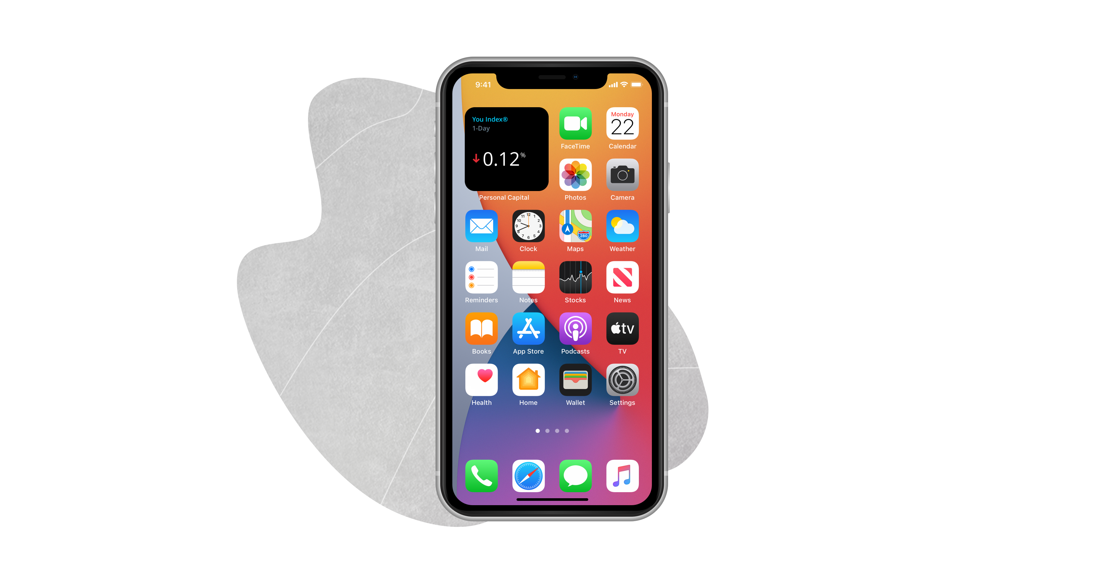
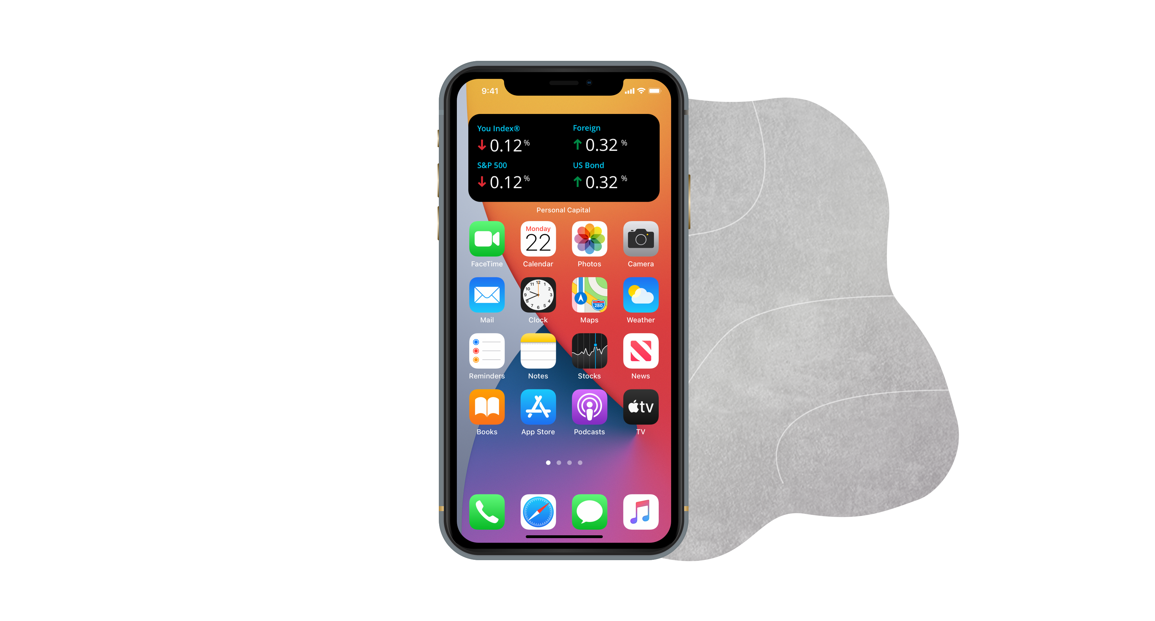
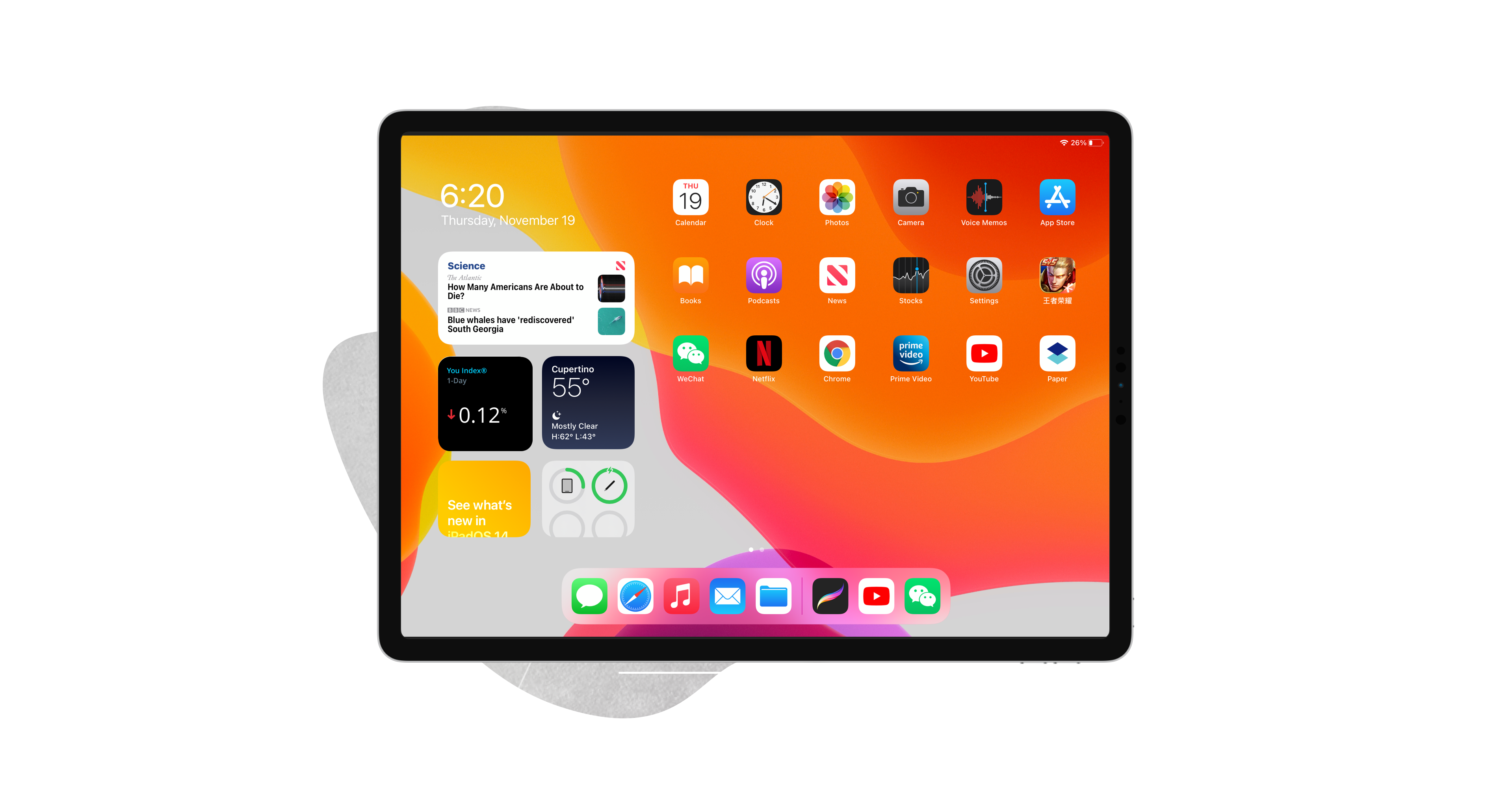
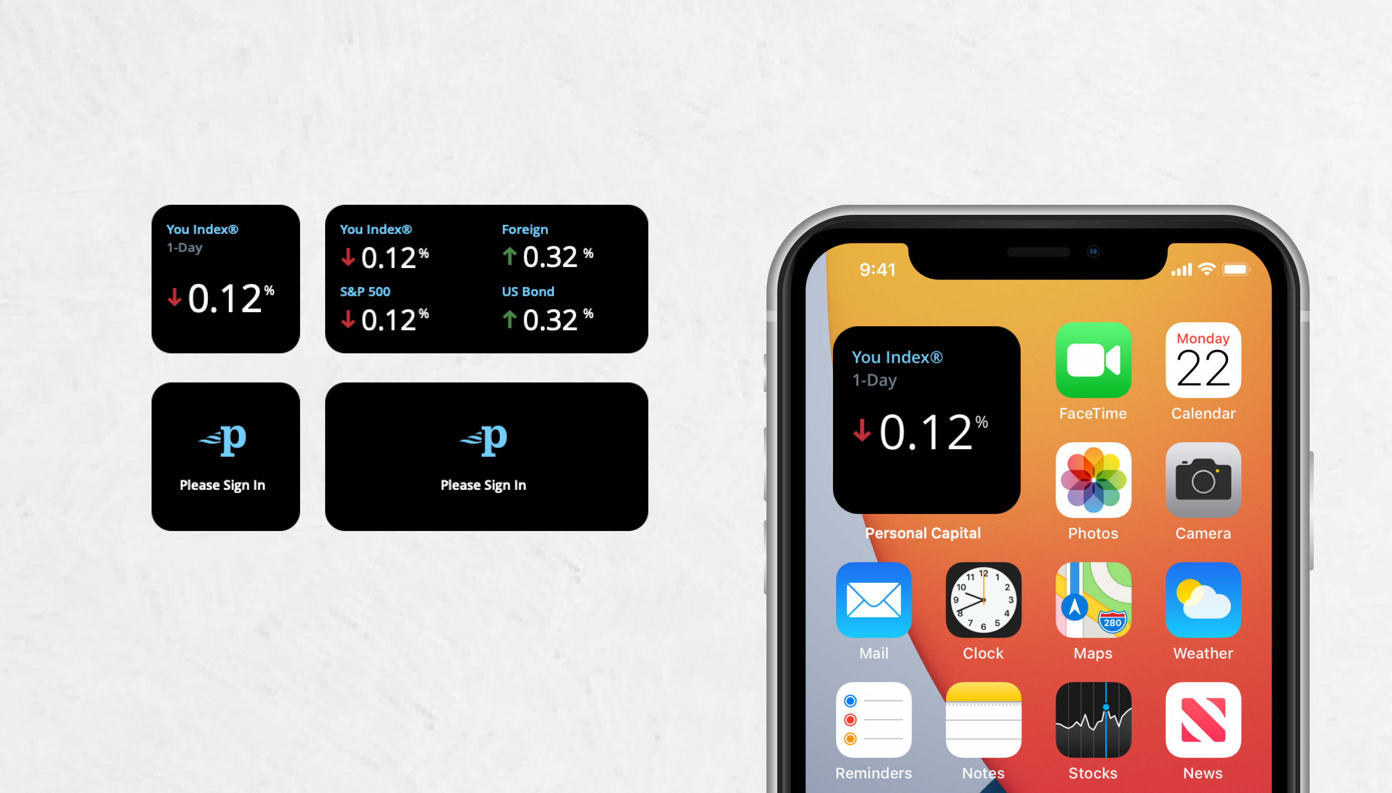
Here is the final design of holdings widgets, and some edge use cases such as need users to sign in to refresh the data etc.
.gif)