We found a giant hole in the market, traditional investment companies like Merrill Lynch they provide professional human advisors but they don't have digital tool and have higher fee. Those robo advisory firms wealthfront and betterment they have digital product but they don't have human advisors. That's where we come in - great tools, along with human advisors at a reasonable cost.
Personal Capital deliver the financial services through an inflexible manual process, they asking clients to schedule an appointment, however over 48.2% of our clients failed to show up in the call which results on two sides: Internally, for advisors it's waste of time to waiting for clients and increase the administrative burden. Externally for clients looking for premium financial services, they tend to withdraw their funds and quit as they didn't receive personalized advice which leads to a revenue decrease.

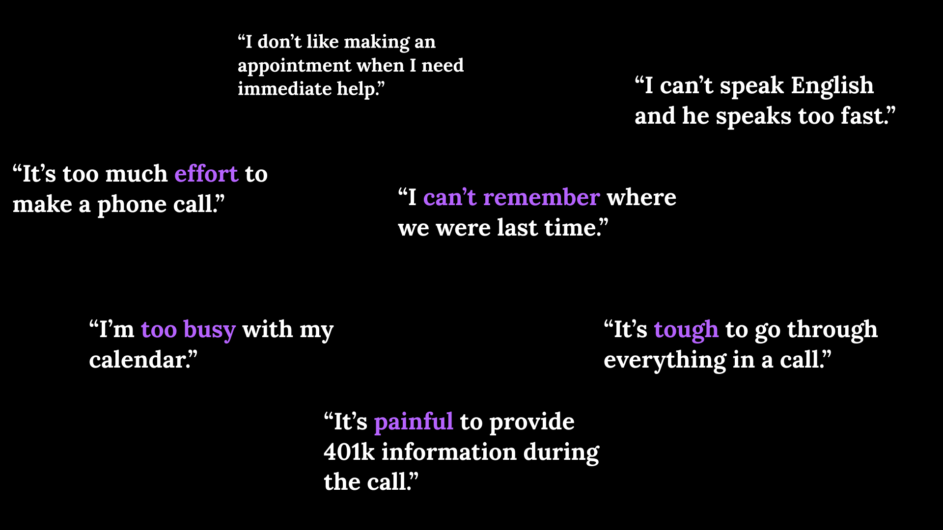
Clients are busy with their calendar and no time for getting a call. They are tend to find a balance between the effort they put in the services and the benefit they could get.
They want to access the services anytime as they want, sometimes other events taking over so they have to cancel the appointment.
Clients prefer to see everything in one place, so they won't switch context from something else to their financial consulting.
1.Unify and simplify the manual financial services flow by automate operation;
2. Provide financial request functionality;
3. Empower clients to learn and achieve to increase Client Engagement.
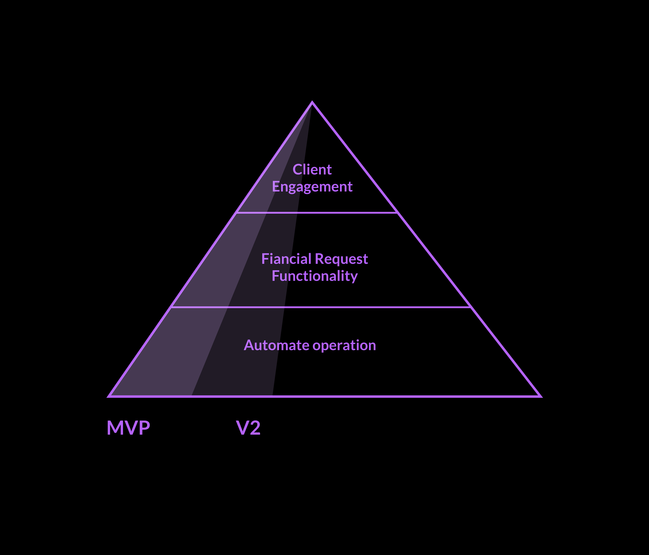

Increase controllable AUM by increasing client engagement:
Increasing the number of financial services that clients completed;
% of clients initiate financial services;
Increase NPS score;
Lower the administrative burden.
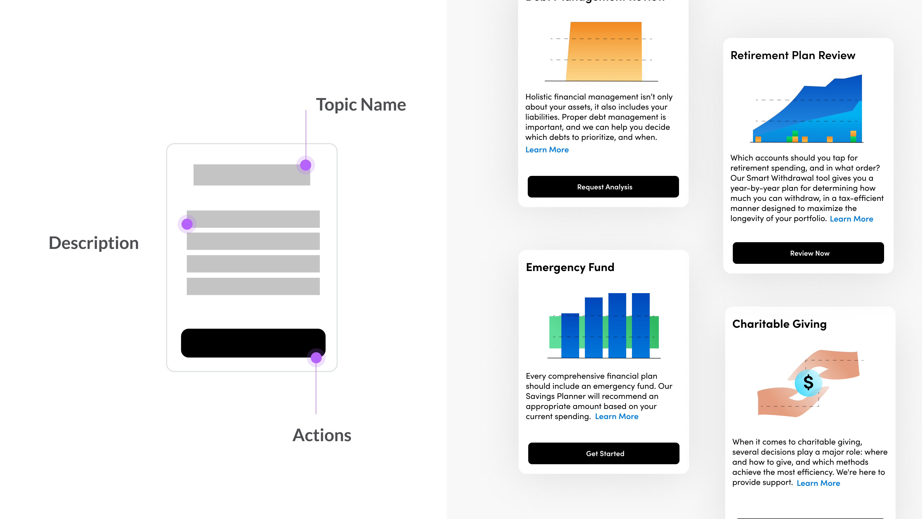
To begin with, how might we visualize a financial topic and make it easy to understand for our paid clients. According to user research, they would like to know a brief description, simple instruction about the topic, so I group those random financial consulting conversation into 28 financial topics, and customize the content with an illustration.
If clients want to learn more, they can tap on the card to expand to full page and scroll down to learn more. I break down the information into different pieces and make it easy to follow.
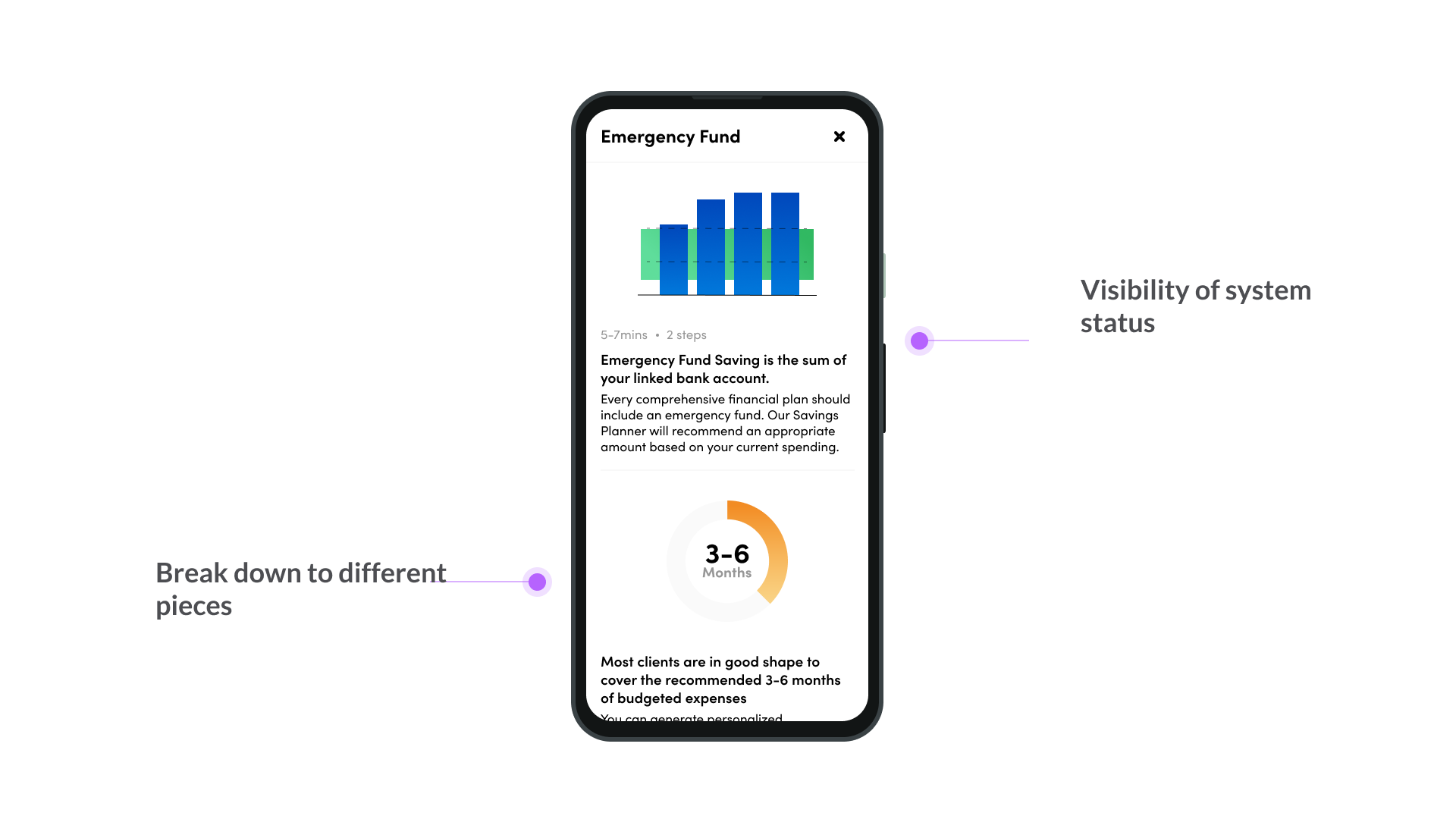
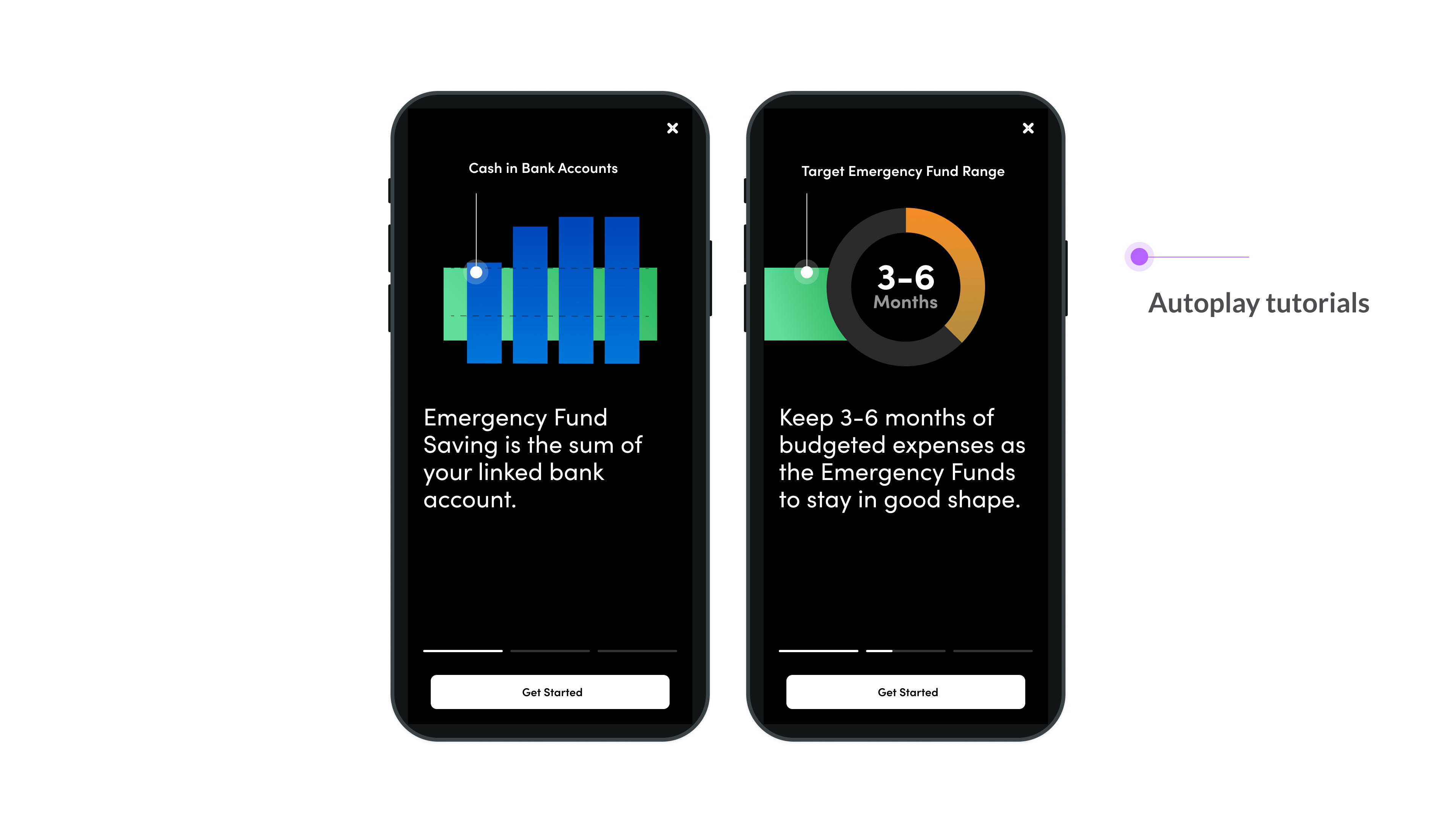
In order to make the complex finance topic more digestable, I leverage the stories pattern here to make it more engaging and straightforward.
This option involved inheriting the look and feel of the milestone bar in the web version. Instead of showing seven milestones on a bigger screen, here I scaled it to three to accommodate the more limited space. Clients can swipe to browse other milestones on one page. However we thought it was too flexible to allow clients focus on one specific topic.

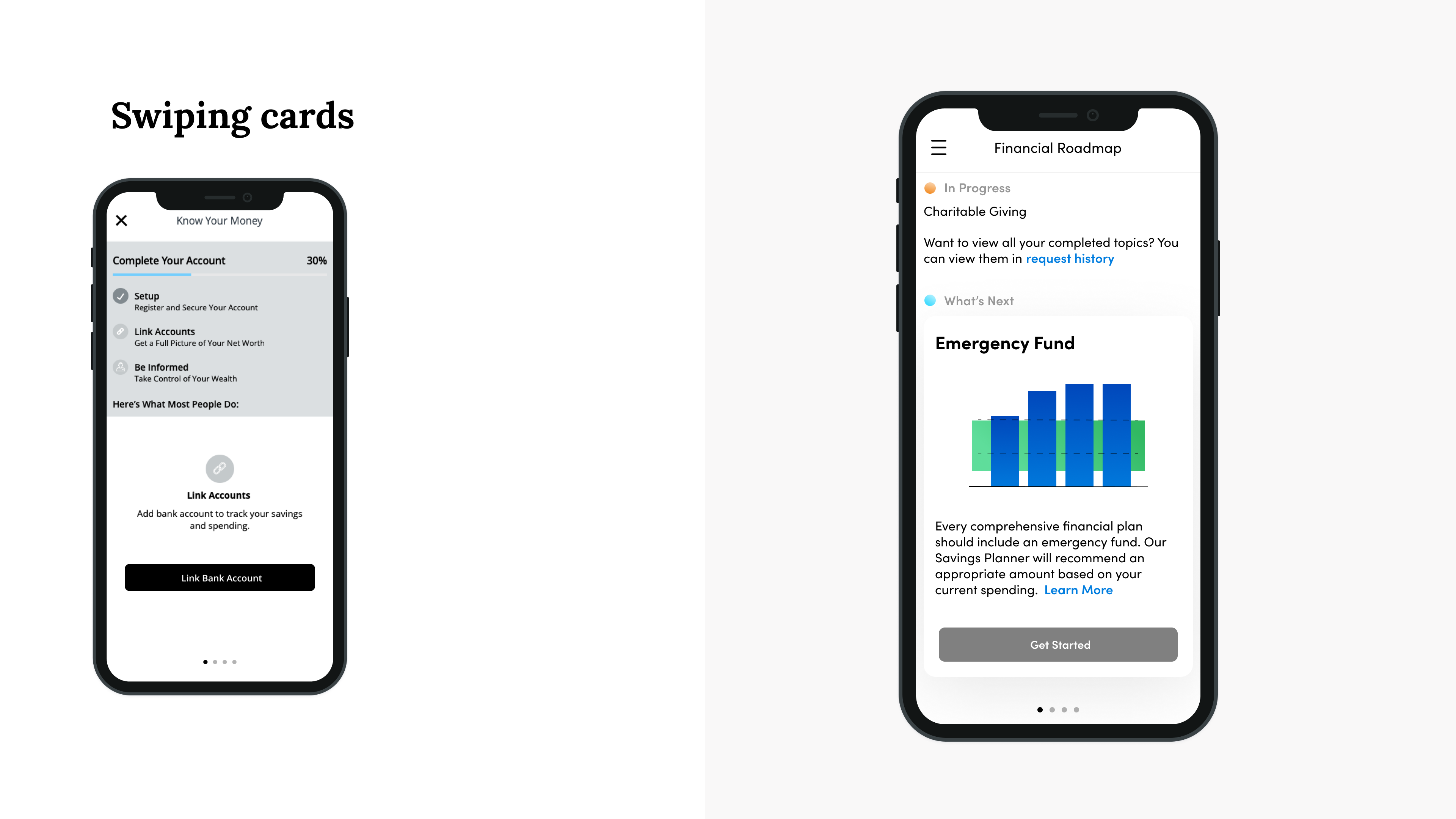
This approach was based on taking our existing mobile framework and making it scale to our new feature. There are some similarities here with the first option, as they both provide the ability to switch between milestones, and it also has the status bar at the top to remind users of what their current state is.
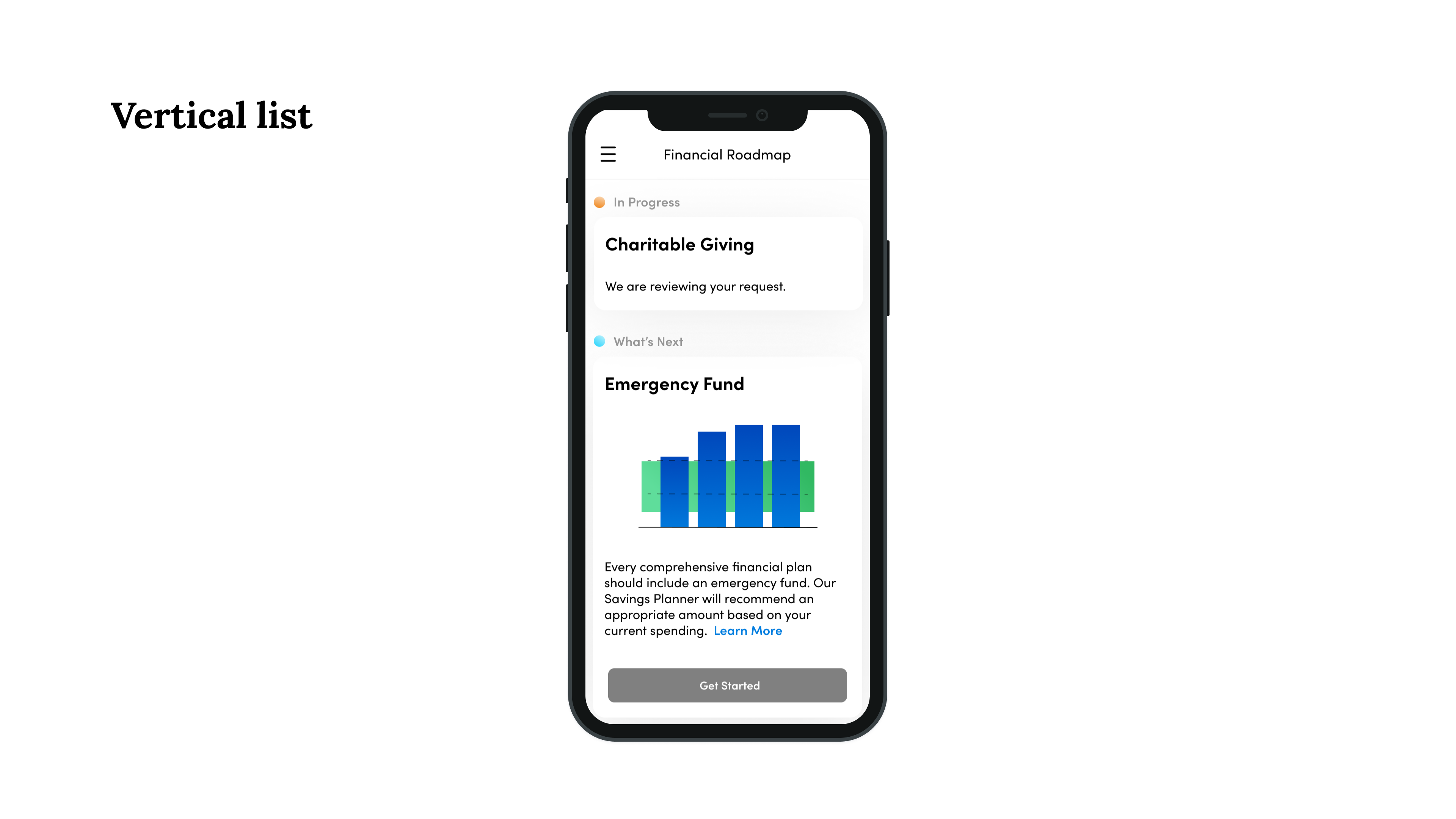
As clients are more concerned about their current status, I came up with the new pattern of only showing the milestones that require actions from clients. In that way, users don't need to think about which one they should do first and they can complete the task effortlessly. It provides a clear focus on the topic list, visual guidance on the importance level of topics with different states.
From the interaction patterns it's not difficult to see which framework delivers the clarity and efficiency to the users. As our clients are elder demographic we believed that a simpler interaction will help address the story.



This is the final iteration of the template design. After we decided to go with the Option 3, since we don't have enough time for the MVP we took out the graphic and content details, and keep the essential information to support the functionality.
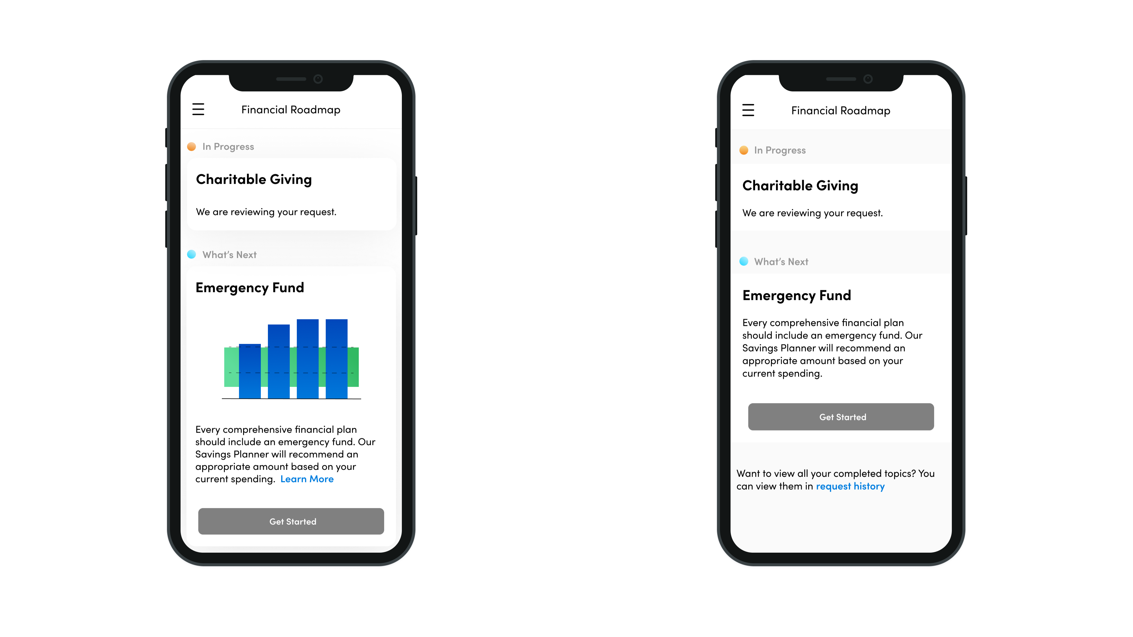
When clients already have financial topic working in progress, it will show a card with orange dot indicator to address the current states.
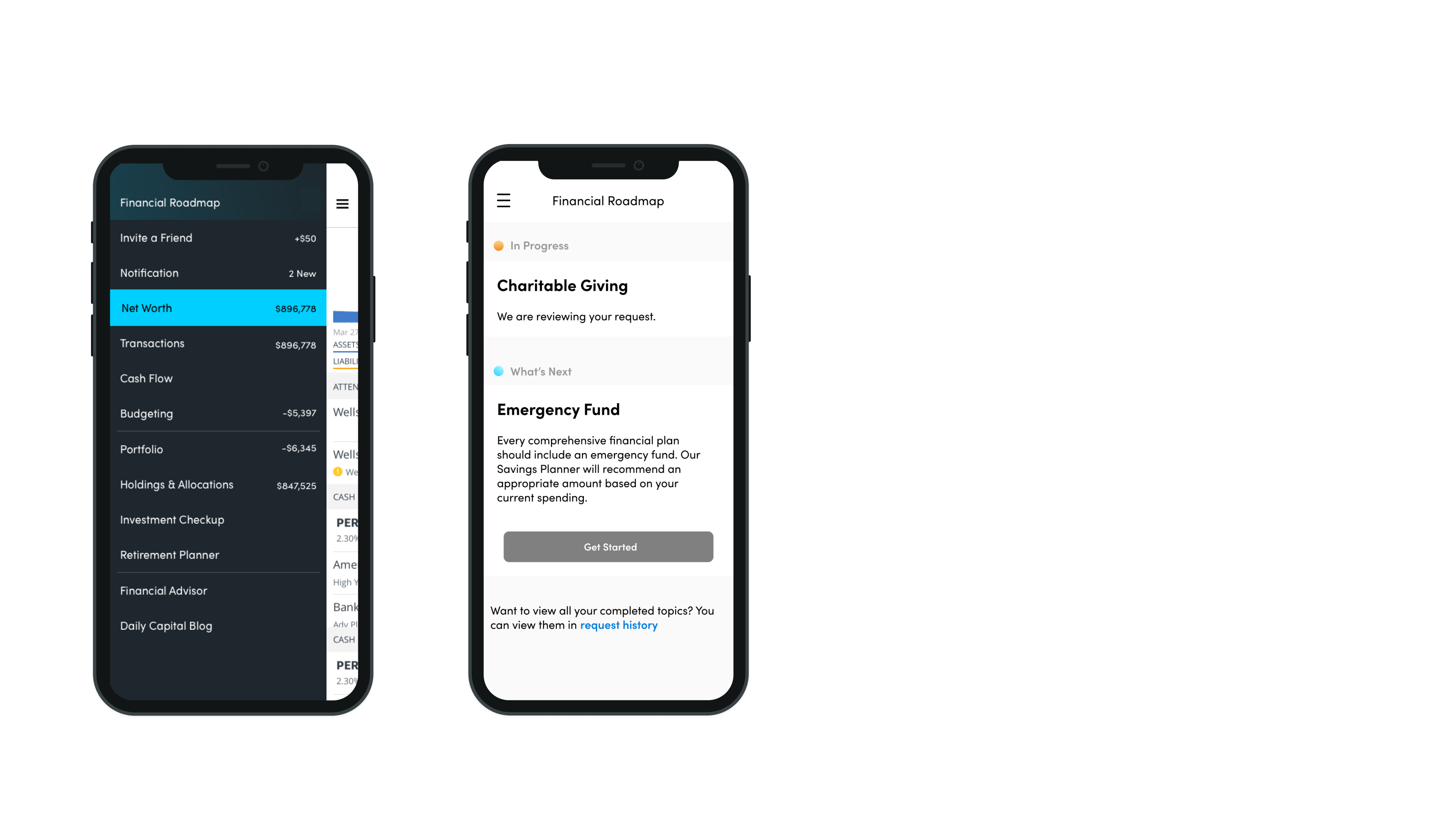
When advisors took time to provide the feedback, it shows a green dot on the sidebar menu to notify users that something is ready to review: they could launch the feature and review the recommendation right away.

If there is no pending financial services nor completed services ready to review, clients can see the blue dot to notify them to start a new one.